Chapter 4: Plotting with ggplot2
In this chapter we will learn some of the ways we can visualize data using graphs. Data visualization is a very powerfull way of learning stuff about your data. Just staring at piles of numbers often wont tell us much. Once we start visualizing the data we can spot problems of illustrate strong relationships between our variables.
We typically use graphs in two contexts: 1) for ourselves - as researchers - to explore and diagnose our data, identify outliers and test assumptions, and 2) to communicate the results of our analyses to an audience. Often different types of graphs are used for these two purposes. Here we will cover a few of the most frequent types of graphs like histograms, scatter plots, bar plots and line plots.
There are great, simple plotting tool built into R. However, these have some limitations in terms of customizing your plots, so the moment we want something slightly more fancy it gets very complicated. Therefore, we will rely on the package ggplot2, which is a fantastic tool that gives you full control and makes you able to do even quite complex stuff in a more intuitive manner.
Installing ggplot2
First, we need to install the ggplot2 package. We covered how we install packages in the previous chapter, but let remind ourselves anyway.
  # Install the ggplot package
  install.packages('ggplot2')

  # Initiate the library
  library(ggplot2)
Remember that you need only to install the package once, but we need the library(ggplot2) in the top of every new script we make if we want to use the ggplotfunctions.
Importing data
Maybe you have already imported the data going through a previous chapter. Otherwise you might need to do so.
  # Set library
  library(ggplot2)

  # set working directory
  setwd("~/Dropbox/Undervisning/Experimental Methods I/Fall_2016/Code")

  # Import data
  DATA = read.delim('SampleDataSet.txt')
Plots for inspecting data and testing assumptions
First we will look at a few of the plots that we often use whenever we need to inspect our data for instance to test if our data are normally distributed our if there are other problems with the data. There are especially two types of plots that are well suited for this purpose: the q-q plots and histograms.
Q-q plots
The q-q plot is an simple way to visually compare some empirical data with a normal distribution. We do that by plotting our empirical data (from the imported data set) on the y-axis against an normal distribution on the x-axis. If our data nicely aligns with a normal distribution the resulting graph gives us a straight 45 degree line. If the shape of the line is curved in one or the other way it is a sign that our data deviates from a normal distribution. Lets have a look at a couple of examples.
  # make q-q plot of the tongue twister data
  qplot(sample = DATA$Tongue_twister_rt)
The output should now appear in the plot window in RStudio and look something like this:
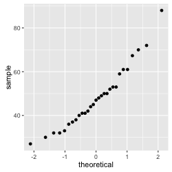
Figure 1: q-q plot of the tongue twister data
Notice that the data seems to fall pretty nicely on a straight line. Even if it is not perfect, our initial impression would be that we deal with data that is normally distributed.
Lets look at another example.
  # make q-q plot of the hold breath data
  qplot(sample = DATA$Hold_breath)
The output:
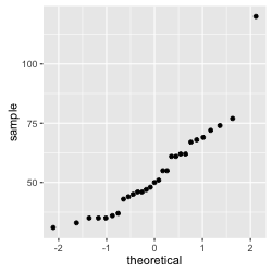 Figure 2: q-q plot of the hold breath data
We observe that in this case the data do not form a straight line. More specifically we have a lonely data point that seems to express an extreme value. This is because one participant, Marc, is especially good at holding his breath. In consequence, we can conclude that the data are not normally distributed.
Histograms
A histogram is another great way to visually inspect some data in order to spot problems of test assumptions. Basically, it plots the values represented in the data on the x-axis and the count of how many times a particular value appears in the data set on the y-axis. This gives us a nice representation of the shape of the distribution.
Let's look at an example, which will also serve to introduce some of the principles in the ggplot syntax.
  # first create ggplot object and define the data
  ggplot(DATA, aes(Tongue_twister_rt)) +
    # then add a "histogram layer"
    geom_histogram()
Let's have a look at the resulting graph:
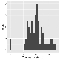
Figure 3: histogram of the tongue twister data
Before we go on to make judgments about normality, let's stay with the aesthetics of the graph. We can freely decide and specify both border and fill color of the bars. We simply do that by specifying color and fill inside the geom_histogram(). We might also want to add a title to our histogram and label for the axes. We do that by adding another layer with the command labs() where we specify these things.
  # first create ggplot object and define the data
  ggplot(DATA, aes(Tongue_twister_rt)) +
    # adding a histogram layer with black borders and white fill
    geom_histogram(color = 'black', fill = 'white') +
    # add title and axis labels
    labs(title = 'Tongue Twister', x = 'Reaction Time', y = 'Count')
The result should look something like this:

Figure 4: Histogram of the tongue twister data with colors, title and axis labels
Histogram with normality density function
Often we use histograms to test if our data are normally distributed. However, sometimes that can be hard to assess if we cannot compare our data more directly to a normal distribution. We can use ggplot to overlay a curve expressing a normal distribution on top of our 'empirical' data, which makes it easier to make judgments. In order to do so we will make a density histogram (rather than a simple count), and we will use the stat_function() to draw the normal distribution curve.
  ggplot(DATA, aes(Tongue_twister_rt)) +
    # add histogram layer and define as density plot
    geom_histogram(aes(y = ..density..), color = 'black', fill = 'white') +
    # add layer that draw a normal distribution density curve
    stat_function(fun = dnorm, args = list(mean(DATA$Tongue_twister_rt), sd(DATA$Tongue_twister_rt)), color = 'red') +
    # add layer with title and axis labels
    labs(title = 'Tongue Twister', x = 'Reaction time (secs)', y = 'density')
The results should look something like this:

*Figure 5: Histogram with density curve expressing the normal distribution
We observe that our distribution is not fitting a normal distribution perfectly, but in fact quite closely, just as our observations from the q-q plot above.
If we want yet more information to inform our decision about normality, we can run a statistical test, relying on the stat.descfunction from the pastecs package covered in the previous chapter. If we set the argument norm = TRUE, the stat.desc run tests for normality, skew and kurtosis. Especially, the output normtest.p gives us a p-value telling us if our empirical distribution is significantly different (p < .05) from a normal distribution or not (p > .05).
  # Test if the data is normally distributed (and round up to two decimals)
  round(stat.desc(DATA$Tongue_twister_rt, basic = FALSE, norm = TRUE), 2)
In this case, the normtest.p = 0.06. This is above the significance threshold which means that our tongue twister data are not significantly different from a normal distribution, that is, they are normal.
Plots for illustrating data and results
We rarely encounter histograms or q-q plots in publications. These are often not the best graphs when we want to communicate the results of our statistical analyses to other people. Here we rather need scatter plots or bar plots, dependent on which kind of data and analysis we are dealing with.
Scatter plots
We use scatter plots when we want to investigate or illustrate a relation between two continuous variables. Thus, scatter plots are great for illustrating correlation and simple regression analyses.
Like the histogram, the scatter plot require us to first create a ggplot() object. However, notice that this time we need to define our aes() object with both and x and y variable. These should be continuous, that is, 'numeric' in R's terms. Once we have defined our ggplot() object, we simply add a layer called geom_point().
Lets look at an example where we are interested in investigating the relation between participants' shoe sizes and their ability to hold their breath.
  # scatter plot of the relation between shoe size and holding breath
  ggplot(DATA, aes(DATA$Hold_breath, DATA$Shoe_size)) +
    # add layer with scatter plot
    geom_point()
The result should look something like this:
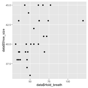
Figure 6: Simple scatter plot showing the relation between shoe size and holding breath
We can get a first impression from inspecting this script. There seems to be a positive relation with bigger feet being related to longer holding breath times but it is not super clear from the plot. In order to support our inspection lets add a linear regression line using the layer command geom_smooth(method ="lm", color = 'red'). We can also just as well add out title and axis label layer.
  ggplot(DATA, aes(DATA$Hold_breath, DATA$Shoe_size)) +
  geom_point() +
  geom_smooth(method ="lm", color = 'red') +
  labs(title = 'Relation between shoe size and holding breath', x = 'Hold breath(secs)', y = 'Shoe size')
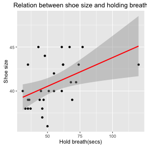
*Figure 7: Scatter plot with linear regression line and axis labels
Now this looks pretty. And the addition of the regression line makes it easier to appreciate that there seems to be a positive relation between our variables, although it seems not too strong. The interpretation could be that shoe size is a proxy for body size which again can explain variability in the ability to hold your breath. However, we might have the suspicion that the relationship is an artefact of the fact that there are both male and female participants. So let's make a seperate progression line for each gender. We can do this quite simply by elaborating the ggplot() object, adding a 'grouping' variable that we want to specify the color of points and regrssion line.
  # define ggplot object with 'gender' as grouping variable
  ggplot(DATA, aes(DATA$Hold_breath, DATA$Shoe_size, color = Gender)) +
    # add scatter plot layer
    geom_point() +
    # add regression line
    geom_smooth(method ="lm") +
    # add title and axis labels
    labs(title = 'Relation between shoe size and holding breath', x = 'Hold breath(secs)', y = 'Shoe size')
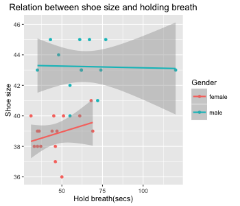
Figure 8: Scatter plot of the relation between shoe size and holding breath grouped by gender
Bar plots
We use bar plots when we want to investigate or illustrate differences or similarities in the mean between different variables. These could be the means from two or more different groups or experimental conditions. We thus often use bar plots to illustate the result from a t-test or ANOVA analysis.
Notice that bar graphs require us to have a categorical variable at the x-axis (e.g. condition 1 or 2) and a continuous variable on the y-axis. This is relavant when we define the aes() of our ggplot() object.
Let's imagine that we are interested in whether right-handed or left-handed participants are better at doing the Romberg task with their eyes closed. Then we can do a bar graph with the categorical variable of right and left handers on the x-axis and the continuous variable of the Romberg data on the y-axis.
  # define ggplot object
  ggplot(DATA, aes(Handedness, Romberg_test)) +
    # add bar plot layer and specify that it should illustrate means
    geom_bar(stat='summary', fun.y=mean) +
    # add title and axis labels
    labs(title = 'Romberg performance by handedness', x = 'Handedness', y = 'Romberg performance (secs)')
This should look something like this:
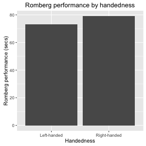 Figure 9: Simple bar plot illustating the mean prformance of the Romberg test divided by handedness
This looks a bit borring so let's add some color using the color = 'some color' for the border color and fill = 'some color' for the fill color.
  # define ggplot object
  ggplot(DATA, aes(Handedness, Romberg_test)) +
  # add bar layer with color specifications
  geom_bar(stat='summary', fun.y=mean, color = 'black', fill = 'dark red') +
  # add title and axis labels
  labs(title = 'Romberg performance by handedness', x = 'Handedness', y = 'Romberg performance (secs)')
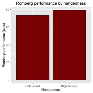
Figure 10: Bar plot with color
Error bars
Now, the plot tell us something about means. However, it can be hard to make inferences about similarities or differences of means if we don't know something about the variance. Therefore we usually prefer our bar plot to also display error bars. Let's add a error bar layer that express the standard error of the mean for each of the variables.
  # define ggplot object
  ggplot(DATA, aes(Handedness, Romberg_test)) +
    # add bar layer
    geom_bar(stat='summary', fun.y=mean, color = 'black', fill = 'dark red') +
    # add error bars expressing SE
    geom_errorbar(stat='summary', fun.data = mean_se, width = 0.2) +
    # add title and axis labels
    labs(title = 'Romberg performance by handedness', x = 'Handedness', y = 'Romberg performance (secs)')
The result should look something like this:
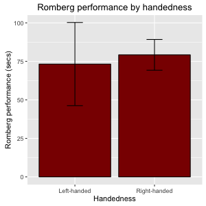
Figure 11: bar plot with error bars
Notice that you can also specify the error bars to express 95% confidence intervals by specifying fun.data = mean_cl_normal.
Now, with the addition of error bars enables us to see that probably the difference between two two group means is not a 'real difference': since the variance of the groups overlab considerably the percieved difference is likely to be due to chance. We will get back to ways to statistically test such differences in later chapters.
Showing more variables with colour or facetting
On the previous plots, we visualized the relationship between two variables. If we want to group the plot based on a third variable, we can use colour to differentiate the groups. With some geoms (geom_point and geom_line and others), we use the colour aesthetic, and with others (geom_bar), we usually want the fill aesthetic. Note that to get the bars side by side, we need to specify position="dodge" for geom_bar, and position=position_dodge(width=1) for geom_errorbar.
# added the fill aesthetic
colour_barplot <- ggplot(data[data$Handedness != "Ambidextrous",], aes(Handedness, Rombert_eyes_closed, fill=Gender)) +
  # geom_bar needs position="dodge" to show the groups beside each other
  geom_bar(stat='summary', fun.y=mean, position="dodge") +
  # geom_errorbar needs position=position_dodge(width=1) to show the groups beside each other and with the proper margins
  geom_errorbar(stat='summary', fun.data = mean_se, width = 0.2, position=position_dodge(width=1)) +
  labs(title = 'Romberg performance by handedness', x = 'Handedness', y = 'Romberg performance (secs)')
colour_barplot

Figure 12: Bar plot with error bars, grouped with the fill aesthetic
In other cases we could give each group a separate canvas with facetting.
ggplot(data[data$Handedness != "Ambidextrous",], aes(Handedness, Rombert_eyes_closed)) +
  geom_bar(stat='summary', fun.y=mean, color = 'black', fill = 'dark red') +
  geom_errorbar(stat='summary', fun.data = mean_se, width = 0.2) +
  labs(title = 'Romberg performance by handedness', x = 'Handedness', y = 'Romberg performance (secs)') +
  # we facet based on the Gender variable
  facet_wrap(~ Gender)
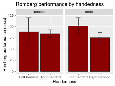
Figure 13: Bar plot with error bars, grouped with facetting
Changing the colour scheme While the dusty flesh and turquoise colours ggplot2 provides by default are great, you may want to use colour (or fill) grouping while still customizing the actual colours. This is done with the scale_* family of functions.
You can give colour values manually:
colour_barplot +
  scale_fill_manual(values=c("MidnightBlue", "PaleGoldenRod"))
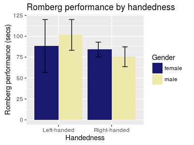
Figure 14: Bar plot with error bars, grouped by colour, and colourized manually
.. or with a colour brewer palette (see more palettes at http://moderndata.plot.ly/create-colorful-graphs-in-r-with-rcolorbrewer-and-plotly/ )
colour_barplot +
  scale_fill_brewer(palette="Dark2")
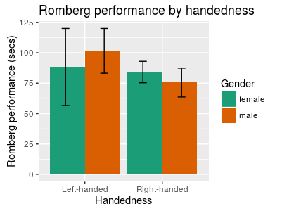
Figure 15: Bar plot with error bars, grouped by colour, and colourized with the "Dark2" RColorBrewer palette